Featuring the 2018 Global Peace Index, this year's candidature was the strongest yet. The Data for a Cause Challenge winners have been announced.
Featuring the 2018 Global Peace Index, this year’s candidature was the strongest yet.
The goal of the 2018 Data for a Cause Challenge is to tell a story using the data behind the Global Peace Index and Global Terrorism Index reports.
We are honoured to be the focus of a #Dataforacause challenge for another consecutive year.
Data visualisation professionals produced visualisations based on the work of the Institute for Economic and Peace’s most recent research, like the Global Peace Index and Global Terrorism Index.
The competition’s goal is to tell a story using the data behind the reports. Data can be powerful, and even more powerful when its presented in a way that makes meaning. We are pleased to be part of the judging panel. Below are this year’s winners.
You can view all of the entries using #dataforacause on Twitter, or find out more on the Data for a Cause website.
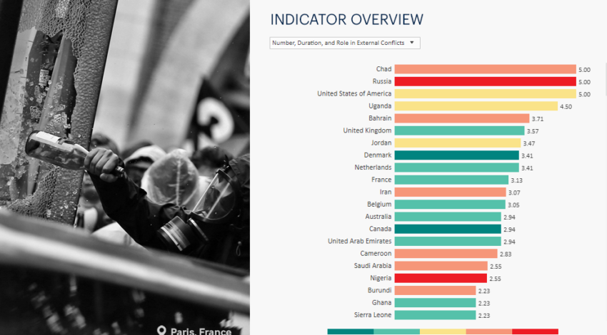
Valerie Mais
This visualisation is clear, concise, and detailed. Overall, it’s a fantastic representation of the data. View it on Tableau here.
David Tran
Allowing for great depth in the information it shows, this visualisation is perfect for exploring the data’s layers. View it here.
Chris Conn
This visualisation provides an impactful regional analysis. View it in Tableau here.
Alex Dixon
The combination of data, images, and text in this visualisation makes it a winner. This visualisation is best seen in Tableau – you can click around and scroll through the story. Click here.